
In the first weeks of December, two seemingly trivial announcements rocked the worlds of design and diplomacy, proving that even the most mundane aesthetic choices are now loaded with cultural and political consequence. On one side, the global arbiter of color unveiled a soothing, controversial new shade for 2026. On the other, the U.S. State Department declared a beloved sans-serif font a casualty of a bureaucratic purge.
Welcome to the new landscape, where a hue and a typeface are reflections of national sentiment and cultural warfare.
Pantone ‘Cloud Dancer’
The Pantone Color Institute, known for setting the global mood with its annual selection, has named PANTONE 11-4201 Cloud Dancer as its Color of the Year for 2026. Described as a tranquil, lofty white, Cloud Dancer is not a clinical optic white but a soft, billowy shade “imbued with a feeling of serenity.”
Pantone experts framed the choice as a conscious statement of simplification and a “cosmic reset button.” In a world saturated with digital noise and constant flux, the color—the first shade of white ever selected—is intended to serve as a blank canvas, encouraging quiet reflection, focus, and a return to essentialism.
However, the choice has proven unexpectedly divisive. While some designers embraced the nod to “quiet luxury” and minimalism, critics on social media called the decision “underwhelming” and even “tone-deaf.” They argued that selecting white during a culturally and politically charged moment was, at best, design inertia and, at worst, an unintentional political symbol. Pantone representatives quickly moved to clarify that the decision was purely about global psychological trends and the desire for calm, but the debate underscores a new reality: in 2026, even neutrality is perceived as a stance.
Calibri vs. Times New Roman
Across the political aisle, another aesthetic battle was decided, this one with immediate, concrete implications for U.S. foreign affairs. Secretary of State Marco Rubio, recently appointed to lead the State Department, issued a directive ordering all American diplomats and staff to return to using the classic Times New Roman typeface in official communications, effectively banning the previously adopted Calibri.
The State Department’s internal cable, dated early December, did not mince words about the motivation behind the change. It explicitly stated that the reversal was meant “to restore decorum and professionalism to the Department’s written work products and abolish yet another wasteful DEIA program.”
The previous administration had switched to Calibri in January 2023, citing the modern sans-serif font’s accessibility. Calibri, favored by diversity and disability advocacy groups, is considered easier to read for individuals with certain visual disabilities, including dyslexia, and is the default font in many Microsoft products, making it highly inclusive.
Rubio’s memo, however, argued that Calibri was “informal” compared to traditional serif fonts, suggesting that typography must adhere to an older standard of “professionalism.” This font fight is a clear example of the current political drive to dismantle Diversity, Equity, and Inclusion (DEI) policies, elevating traditional aesthetic formality over accessibility and modern usability in government functions. What was once a simple formatting preference has been rebranded as a crucial ideological boundary.
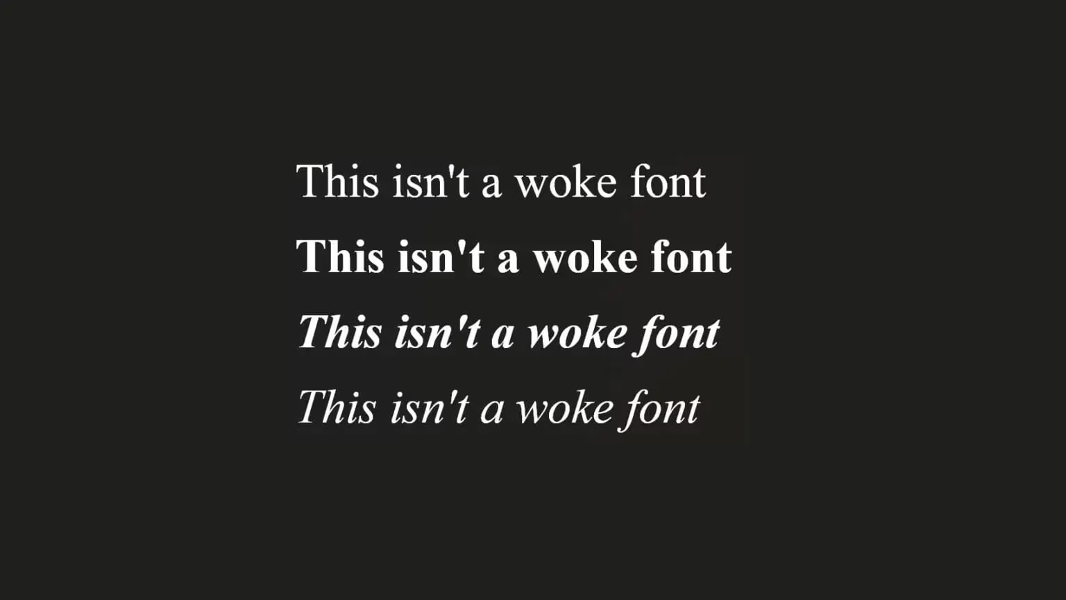
Lucas de Groot, the Dutch typographer who created Calibri in the mid-2000s, disagrees.
‘There’s nothing woke in it, maybe just a friendliness,’ says de Groot. ‘Like most of my typefaces, I try to design with a little bit of a humanistic touch, because I think the subtle voice a typeface transmits is really important in conveying messages.’
‘If you compare a line of text in Times New Roman with a line of text in Calibri on a high-resolution screen, you will immediately see that the Times New Roman is too spindly,’ he says. ‘Times New Roman, as implemented in the Windows operating system, is a low-quality font.’
[source]
The simultaneous emergence of Pantone’s controversial white and the State Department’s war on Calibri illuminates a powerful trend: cultural authority, whether held by a color consortium or a government secretary, is defined through aesthetic control.
Cloud Dancer represents a global, market-driven desire for simplicity and escape from chaos, a blank slate that paradoxically drew criticism for what it represents (or fails to represent) in a diverse world. Meanwhile, the mandated return to Times New Roman illustrates a political desire for a return to tradition, using a 90-year-old typeface to signal a broader policy shift away from equity and inclusion efforts.
With 2026 almost upon us the choices we make about how we visually represent ourselves have never been more scrutinized—or more indicative of the deeper cultural currents shaping society. The aesthetics of 2026 are already proving that nothing, not even a simple font (superior to TNR), is politically neutral.
Leave a Reply